App Development for Docuverse
A walkthrough of my mobile app designs


Design challenge and responsibilities overview
PROCESS HIGHLIGHTS
Timeline
June 2023 - July 2023
Responsibilities
Tools
UX/UI Mobile Design
Sketching
Figma
Adobe CS
Procreate
Slack
UX Research
Prototyping
User Experience Design
User Interface Design
Disciplines
Challenge
Design an app that transforms document management into a seamless, intuitive experience. The goal was to make uploading, analyzing, and organizing documents effortless, blending powerful functionality with a user-friendly design.
Create a unique app that redefines document management by streamlining tasks and enhancing productivity. The goal was to empower users with an all-in-one solution while addressing both personal and professional needs.
Opportunity
Our Vision
BACKGROUND
At Docuverse, we envision a future where document management becomes a seamless and empowering experience for everyone. Our app aims to simplify how users interact with their documents, enabling them to effortlessly capture, analyze, and organize information. By streamlining these processes, we not only save users time and effort but also help them stay more productive and focused on what truly matters.
The Process
Research
Identifying Problems
Desk Research
Competitor Analysis
User Surveys
Synthesis
Persona
User Journey
Ideation
Developing a Solution
Moodboard
Low Fidelity
Mid Fidelity
High Fidelity
Final Designs
Design System
UI for Launch
Reflection
Post Designs
Post Thoughts
1
2
3
4
5
Initial Problem Discovery
RESEARCH
Managing documents has always been a time-consuming task, but in today’s fast-paced, digital world, the lack of efficient, all-in-one solutions has become even more apparent. People often rely on fragmented tools—scanners, file storage apps, and manual data entry—which feel disconnected and inefficient. Recognizing this gap, we set out to create a solution that integrates these tasks seamlessly, empowering users to manage, analyze, and organize their documents effortlessly from one place.
On the other hand, a significant challenge arose in the realm of document management. While digital tools have evolved to handle specific tasks, they often function in silos, leaving users with fragmented workflows. Many individuals struggle to capture, analyze, and organize information efficiently, especially when switching between devices or methods. This gap in seamless document handling not only wastes time but also limits productivity, highlighting the need for a unified, all-encompassing solution.


To define the problem, users struggle with inefficient document management systems that require juggling multiple tools and methods. This leads to wasted time, disorganization, and decreased productivity. The lack of a unified solution hinders the ability to capture, analyze, and organize information seamlessly, impacting both personal and professional efficiency.
Desk Research
RESEARCH
Before designing, I researched key statistics and insights on document management trends, user needs, and emerging technologies to inform a user-centered approach.
User’s Perspective
Brand’s Perspective
•
Users struggle to manage documents efficiently.
•
Users can’t easily locate relevant documents or information.
•
Users don’t gain benefits for sharing or organizing their documents effectively.
•
Document management is disjointed, requiring multiple steps and tools.
•
Information capture and analysis are manual and time-consuming.
•
Organizing and storing documents is inefficient and error-prone.
•
Users struggle with syncing documents across devices and platforms.
85%
of users prefer an all-in-one solution for managing documents over using multiple separate tools.
78%
of professionals report spending too much time searching for and organizing documents.
69%
of consumers believe a faster document processing system enhances their overall productivity.
Competitor Analysis
Although Docuverse introduces a unique approach to document management, we researched existing solutions that streamline tasks like file organization and data extraction. We analyzed companies offering standalone tools or fragmented systems to understand their strengths and limitations, focusing on user adoption, ease of use, and overall efficiency. This helped us identify gaps in the market and refine our solution to offer a more seamless, integrated experience.


A popular note-taking and document organization app
that allows users to store, organize, and sync their notes,
documents, and images across multiple devices.
A cloud-based storage solution offering users the ability to store, share, and organize documents and files, with collaborative features for real-time editing.
A cloud storage and document management platform
integrated with Microsoft Office tools, allowing users to store, share, and manage documents across devices.
RESEARCH
User Surveys
RESEARCH
Although Docuverse offers a novel approach to document management, we conducted surveys to gather insights from users of existing document management solutions. Our goal was to understand their pain points, preferred features, and experiences with current tools. This helped us identify key areas where users face challenges, such as inefficient organization, lack of integration, and manual data entry. By understanding user needs and frustrations, we could refine our app to better meet their expectations and improve overall efficiency.


65%
of users in document management apps struggle with slow upload speeds
58%
of users find it difficult to organize and retrieve their documents efficiently
of users feel frustrated by the lack of real-time collaboration features
47%
42%
of users express concerns over the security of their documents
52%
of users report issues with syncing documents across multiple devices
And after these 200 surveys, we can conclude that:
User Pain Points
User Persona
SYNTHESIS
For Docuverse, I created a user persona based on research, including problem discovery, surveys, competitor analysis, and pain points. This persona captures the user's needs, preferences, and behaviors, guiding the app's development to better address pain points and enhance the document management experience.

A busy professional seeking a faster, more efficient way to manage, upload, and collaborate on documents, frustrated by disorganization and time-consuming workflows.
Frustrations
Majdi Betbout 24
Junior Web/Dev
Master
Tunis.Tunisia
Emotional state during the process
Content
Satisfaction
Engagement
Finding efficient solutions
Struggling to find reliable tools for seamless document organization and collaboration.
With Docuverse's technology, users can efficiently manage, upload, and analyze documents in one place. This allows individuals and teams to streamline their workflow, collaborate seamlessly, and enhance productivity, ultimately providing a smoother and more efficient document management experience.
Developing a Solution
IDEATION
Design Goals:
Streamline Document Management: Create an intuitive interface that allows users to easily upload, organize, and access their documents in one centralized platform.
Enhance Collaboration: Enable seamless sharing and real-time collaboration on documents, helping teams work more efficiently together.
Improve User Engagement: Incorporate features like personalized recommendations and notifications to keep users actively engaged with the app.
Provide Actionable Insights: Integrate document analytics and search features that empower users to quickly find and analyze their files, improving productivity.

Moodboard
IDEATION


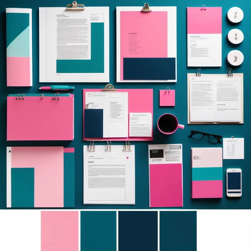
Color Palette Overview for Docuverse
Color Palette Overview for Docuverse
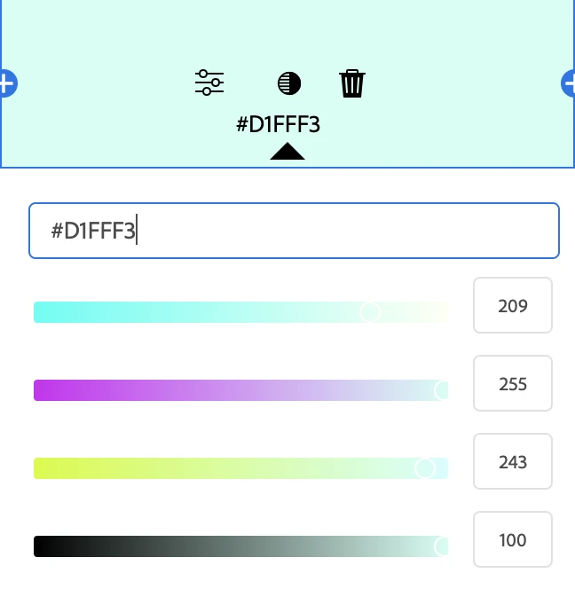
The color palette for Docuverse uses #e8ea6 for a fresh, welcoming feel, #ffd1d1 for soft,
calming accents, and #d1fff3 for a light, clean background that enhances readability
and user engagement.
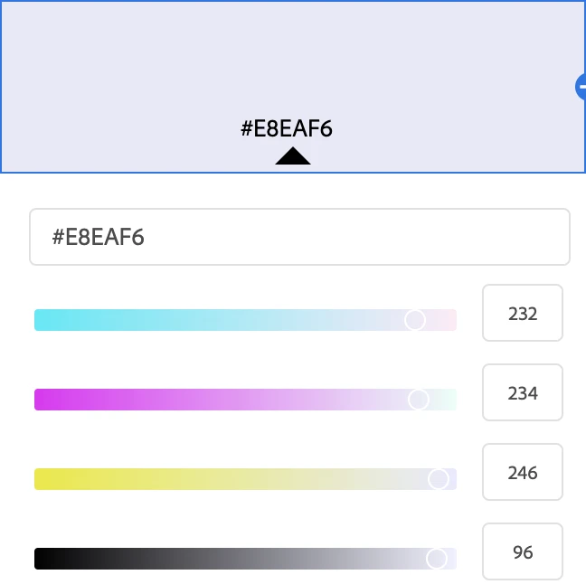
The color palette for Docuverse incorporates #242283, #2cd5a9, and #d522c to create a modern and
dynamic user experience. The deep blue (#242283) offers a professional and trustworthy feel,
while the vibrant teal (#2cd5a9) brings a refreshing and innovative touch. The accent pink (#d522c)
adds energy and highlights key interactions, making the app visually engaging and easy to navigate.


Following the User Flows, I researched mobile apps and websites known for their outstanding user experience and interface design. This research was invaluable in my ideation process, providing inspiration from designs that have effectively engaged users. It also helped me identify key features to include in Docuverse, while allowing me to eliminate unnecessary elements to keep the design streamlined and user-focused.
Low-Fidelity
IDEATION
Here are my initial thoughts on the research and goals for Docuverse. The low-fidelity designs offered an early vision of how the app could function, showcasing the core features and setting the foundation for its user experience.

Major Improvements + Design Decisions
IDEATION
For the high-fidelity designs leading up to launch, we conducted user testing with my team, potential users, and stakeholders. Based on the feedback, we implemented three key improvements and design decisions to address user needs and align with the app’s identity.
Onboarding Screen
We designed a streamlined onboarding experience to introduce new users to Docuverse’s core features. The screen highlights the app’s key functionalities—document upload, organization, and analysis—through simple visuals and concise text, ensuring users quickly understand the value of the platform.

The next major design decision was deciding on the color scheme. After conducting color theory research, we learned that
the color green represents "new beginnings and growth," and we wanted to move towards that path. Another crucial aspect
we had to consider was designing for accessibility.

File Type
•
Light Mode: Designed for clarity and readability, the light mode offers a clean, minimalist interface ideal for well-lit environments. Its use of neutral tones ensures focus on content without causing strain.
•
Dark Mode: Crafted for low-light conditions, the dark mode reduces eye strain while conserving device battery life. The high-contrast design enhances visibility and usability in darker settings.
Light/Dark Mode
To enhance user experience, I designed both light and dark modes, allowing users to choose their preferred interface for comfort and accessibility
LIGHT/DARK MODE

Design System
FINAL DESIGNS
Through the creation, iteration, and refinement of countless wireframes, I finalized the UI designs for the pilot phase of my app. Working alongside another designer, I developed a comprehensive design system and style guide. This ensured consistency in white space, balance, and visual unity, while providing developers with clear specifications for seamless implementation in the app.
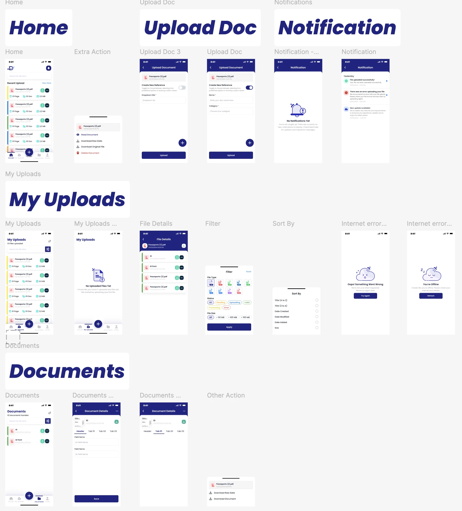
Status
All
Pending
Uploading
Valid
Processing
Error
Passaporto (3).pdf
04/30/2024 8:35 PM
01 Page
03 Doc
2,0 MB
Passaporto (3).pdf
04/30/2024 8:35 PM
01 Page
03 Doc
2,0 MB
Passaporto (3).pdf
04/30/2024 8:35 PM
01 Page
03 Doc
2,0 MB
Passaporto (3).pdf
04/30/2024 8:35 PM
01 Page
03 Doc
2,0 MB
Passaporto (3).pdf
04/30/2024 8:35 PM
01 Page
03 Doc
2,0 MB
Passaporto (3).pdf
04/30/2024 8:35 PM
01 Page
03 Doc
2,0 MB
9:41
Accueil
My Uploads
Documents
Profile
Search for file here
My Uploads
03 files uploaded
9:41
ID
04/30/2024 8:35 PM
ID front
04/30/2024 8:35 PM
Passaporto (3).pdf
04/30/2024 8:35 PM
Passaporto (3).pdf
04/30/2024 8:35 PM
File Details
Passaporto (3).pdf
04/30/2024 8:35 PM
Reset
Apply
Filter
File Type
Status
All
Pending
Uploading
Valid
Processing
Error
File Size
All
> 50 MB
> 100 MB
< 100 MB
Splash
FINAL DESIGNS

UI for Launch
FINAL DESIGNS

After completing this event app case study, I reflected on how much I have grown as a UX/UI designer. I honed my technical skills by using tools like grids, auto-layout, and consistent design systems to create a polished and cohesive interface. I also enhanced my interaction design abilities, focusing on intuitive user flows and anticipating how participants would navigate the app. Most importantly, I strengthened my design thinking by prioritizing user needs and integrating feedback at every stage of the process. This experience has been invaluable, and I’m excited to apply these skills to future projects!
Conclusion
REFLECTION
Portugal
Copyright © 2024 MFA. All rights reserved.
Pages
Work
About
Resume
Selected Work
Donation
Buy me a coffee
Connect
Work
About
Resume
Portugal
Copyright © 2024 MFA. All rights reserved.
Selected Work
Donation
👋 Thanks for stopping by! connect if you want to know more :)